Create a high-performing site with the right design elements.
From visual appeal to seamless navigation, discover how strategic design enhances user experience and drives conversions, giving your business a competitive edge.
In today’s digital landscape, incorporating modern web design elements is essential for attracting and retaining visitors.
A well-designed site doesn’t just look great—it also enhances user experience, improves SEO, and drives conversions.
But what exactly makes a website design effective? In this article, we’ll break down the essential website design elements that help your site stand out and succeed.
Whether you’re a small business owner or a marketing professional, understanding these elements can give you a strategic edge in web design and digital marketing.

1. User-Centred Design (UCD)
User-centred design (UCD) ensures that every aspect of your website is created with the end user in mind.
Instead of focusing solely on aesthetics, UCD prioritises usability, accessibility, and meeting user needs. A user-centred website design not only improves user experience but also boosts your search engine rankings.
- Quick Action Tip: Start with a user persona to guide design decisions based on your target audience’s needs.
Relevant Tools
- UserTesting: Conduct real-time user tests to gain insights into how visitors interact with your site.
- Hotjar: Use heatmaps and session recordings to understand user behaviour.
Real-Life Example
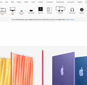
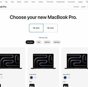
Apple’s website uses a user-centred approach with clean layouts, intuitive navigation, and product pages designed to inform and guide users effortlessly.
Common Mistakes to Avoid
- Failing to test with real users. What works for the design team might not work for the end users.
- Overloading the design with features that users don’t need or want.
For a more in-depth approach to user-focused design, explore our UI/UX design services.

2. Clear Navigation
Navigation plays a crucial role in guiding visitors through your website and helping them find the information they need.
If your navigation is confusing, visitors may quickly leave, increasing your bounce rate and harming SEO. Effective navigation is clear, straightforward, and intuitive.
- Quick Action Tip: Limit navigation menus to five or six main categories and use submenus where needed.
Relevant Tools
- Crazy Egg: Allows you to test different navigation setups and see which layout works best.
- Optimal Workshop: Test navigation with tree testing to ensure a logical, intuitive structure.
Real-Life Example
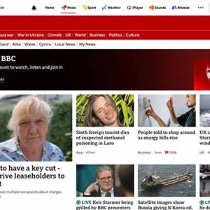
The BBC website has a clean and clear navigation system. Its primary menu is straightforward, and each category has a dropdown with easily identifiable sub-categories.
Common Mistakes to Avoid
- Overloading the main menu with too many options.
- Using complex or obscure language for menu items, making it harder for users to understand.
Learn more about how our web design services can enhance your website’s navigation for optimal user experience.

3. Responsive Design
With mobile devices accounting for a significant portion of web traffic, responsive design is essential.
Responsive websites adapt to different screen sizes, offering a seamless experience across devices.
- Quick Action Tip: Test your site on at least three different device types (smartphone, tablet, desktop) to ensure responsiveness.
Relevant Tools
- Google Mobile-Friendly Test: Evaluate if your website is mobile-friendly.
- BrowserStack: Test your website across different devices and browsers to check its responsiveness.
Real-Life Example
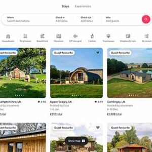
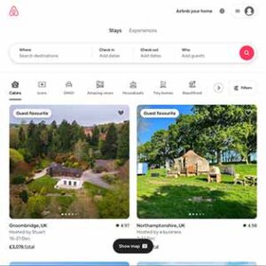
Airbnb is a leader in responsive design, with its layouts and buttons adapting seamlessly to screens of all sizes.
Common Mistakes to Avoid
- Ignoring mobile testing. Desktop-focused designs may look messy on smaller screens.
- Not optimising images for mobile, leading to slow load times on mobile devices.
Responsive design isn’t just a user experience booster; it also improves your SEO performance. Learn more about our SEO services for responsive and optimised designs.

4. Fast Loading Speeds
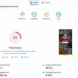
A slow-loading website can frustrate visitors and result in lost conversions. It can also negatively impact SEO, as search engines prioritise fast-loading sites.
Aim for a load time of under three seconds for an optimal user experience.
- Quick Action Tip: Compress images and leverage caching to reduce load times.
Relevant Tools
- PageSpeed Insights by Google: Provides recommendations on speeding up your site.
- Pingdom: Helps identify areas slowing down load times, from images to third-party scripts.
Real-Life Example
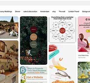
Pinterest improved its loading speed by compressing images and saw a 15% increase in traffic.
Common Mistakes to Avoid
- Using uncompressed images or videos, which can dramatically slow load times.
- Ignoring caching and not leveraging content delivery networks (CDNs).
Our SEO audit services identify critical areas for speed improvement to help your site achieve peak performance.

5. Optimised Visual Elements
Visual elements—such as images, graphics, and videos—can enhance your website’s appeal but can also detract if overused or unoptimised.
High-quality visuals make your site more attractive, but they must be optimised for fast loading and accessibility.
- Quick Action Tip: Use lazy loading for images below the fold to improve page speed.
Relevant Tools
- TinyPNG: Compress images without sacrificing quality.
- Optimizilla: Allows you to control quality for various image types.
Real-Life Example
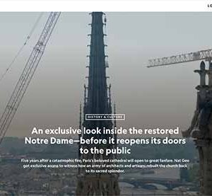
The National Geographic website balances beautiful, high-quality images with fast load times through optimised graphics.
Common Mistakes to Avoid
- Using excessive visual elements, leading to a cluttered look.
- Failing to add alt text, making images inaccessible to visually impaired users and reducing SEO impact.
Discover how our web design services can create visually engaging sites that balance aesthetics and performance.

6. Engaging, Relevant Content
Content is the foundation of a successful website.
Engaging, well-structured, and relevant content keeps visitors on your site, builds trust, and can guide them toward making a purchase or contacting you.
Content also plays a key role in SEO, as high-quality content is likely to rank better on search engines.
- Quick Action Tip: Organise content in bite-sized sections with headings, bullet points, and clear language. Always prioritise quality over quantity.
Relevant Tools
- Grammarly: Ensures content is clear, error-free, and concise, enhancing readability.
- Hemingway App: Helps improve readability by suggesting simpler phrasing and removing unnecessary words.
Real-Life Example
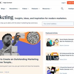
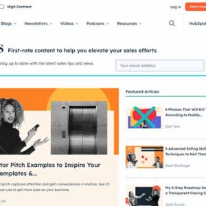
HubSpot’s blog consistently provides valuable, well-structured content for marketers, positioning them as a trusted resource in the industry.
Common Mistakes to Avoid
- Overloading pages with text-heavy content, which can overwhelm visitors.
- Writing content that is overly technical or jargon-heavy, alienating non-expert users.
Visit our digital strategy consultancy for content strategies that drive engagement and conversions.

7. Strong Call-to-Action (CTA) Placement
Your website should guide users toward specific actions, such as signing up, contacting you, or making a purchase. Effective CTA placement is essential for boosting conversions and creating a smooth user journey.
- Quick Action Tip: Use action-oriented phrases like “Get Started” or “Learn More.” Place CTAs strategically, ensuring they are visible without disrupting the flow of the page.
Relevant Tools
- Unbounce: Allows A/B testing for CTAs, helping you determine the most effective language and placement.
- Optimizely: Optimises CTA positions with split-testing and personalised recommendations.
Real-Life Example
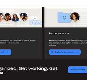
Dropbox places a simple yet prominent CTA, “Sign Up Free,” in a bright button on the homepage, which stands out against the minimalist design.
Common Mistakes to Avoid
- Using vague or passive CTA language (e.g., “Click Here”) that lacks impact.
- Placing CTAs too close together, which can make visitors feel pressured or overwhelmed.
Our web design services are designed to optimise CTA placement, encouraging visitors to take action.

8. SEO-Friendly Structure
An SEO-friendly website structure allows search engines to easily crawl and index your site.
Properly structured websites have clear headings, organised content, and well-marked meta descriptions, making them more likely to rank higher on search results.
- Quick Action Tip: Use descriptive URLs, organise content into logical sections, and apply keyword-rich headings.
Relevant Tools
- Screaming Frog SEO Spider: Helps identify structural SEO issues, such as missing meta tags or broken links.
- Yoast SEO Plugin (WordPress): Assists with adding meta tags, optimizing images, and other SEO essentials.
Real-Life Example
Amazon’s website is optimised with detailed product URLs and structured data, enabling search engines to identify products and categories quickly.
Common Mistakes to Avoid
- Overloading URLs with keywords, which can be seen as spammy.
- Neglecting alt text for images, which can limit accessibility and search engine visibility.
Optimising your website for search engines? Our SEO services offer comprehensive strategies to enhance visibility.

9. Consistency Across Pages
Consistency in design elements—such as fonts, colours, and button styles—builds brand recognition and makes navigation smoother for users.
A consistent design across all pages gives a professional appearance and makes the site feel cohesive.
- Quick Action Tip: Develop a style guide for your website that includes rules for typography, colour schemes, and layouts.
Relevant Tools
- Frontify: A tool to create and maintain a style guide, ensuring brand consistency.
- Adobe XD: Useful for creating a cohesive design framework across all pages before launching.
Real-Life Example
Mailchimp’s website maintains consistent fonts, colours, and button styles, creating a visually cohesive brand experience across all pages.
Common Mistakes to Avoid
- Mixing fonts and colours randomly across pages, which can confuse users and dilute brand identity.
- Inconsistent icon and button styles, making the interface feel less professional.

10. Robust Security Features
Security is critical for any website, especially for e-commerce or data-driven sites.
Basic security elements, like SSL certificates, ensure user information is safe, boosting customer confidence.
- Quick Action Tip: Enable HTTPS, set up secure login protocols, and regularly update plugins to protect your site from vulnerabilities.
Relevant Tools
- Sucuri: Offers security solutions, including malware detection and firewall protection.
- Cloudflare: Provides SSL certificates and DDoS protection, adding extra layers of security.
Real-Life Example
Etsy prioritises security for its marketplace, using HTTPS, SSL certificates, and security protocols to protect sensitive payment information.
Common Mistakes to Avoid
- Failing to update plugins and software, leaving the website vulnerable to attacks.
- Skipping SSL certificates, which can make users wary and lead to lower search engine rankings.
Our web design services focus on implementing robust security measures to protect your website and its users.

11. User Feedback and Analytics Tools
User feedback tools, such as feedback forms and live chats, offer insights into how visitors experience your site.
Additionally, analytics tools like Google Analytics allow you to track user behaviour, helping you make data-driven improvements.
- Quick Action Tip: Use tools like Hotjar for heatmaps to visualise where users interact most, helping you optimise those areas.
Relevant Tools
- Google Analytics: Tracks site metrics and user interactions, offering insights for improvement.
- Hotjar: Provides heatmaps, session recordings, and feedback forms to gather user insights.
Real-Life Example
Slack uses feedback forms and analytics tools to track user satisfaction and continuously improve its user interface.
Common Mistakes to Avoid
- Ignoring user feedback, which can lead to poor user experiences and high bounce rates.
- Over-relying on quantitative data and ignoring qualitative feedback, which provides deeper insights into user needs.

12. Brand Cohesion and Recognition
A cohesive brand experience across your website is essential to building trust and recognition.
Your website design should align with your overall brand identity, including your logo, colour scheme, typography, and messaging.
This consistency builds credibility and helps users connect your website to your other business materials, creating a unified experience across online and offline platforms.
- Quick Action Tip: Ensure consistent brand colours and styles across all pages to reinforce your brand’s identity.
Relevant Tools
- Coolors.co: Generates consistent colour schemes that align with your branding.
- Canva: Helps create visual assets that align with your website’s colour and style guidelines.
Real-Life Example
Nike’s website and brand materials, from product packaging to mobile apps, use a uniform black, white, and accent colour scheme, solidifying their strong brand identity.
Common Mistakes to Avoid
- Inconsistent logo placements and colour schemes across pages.
- Overloading the site with different fonts or visual styles that clash with brand guidelines.

13. Website Launch and Maintenance Efficiency
Launching a website in a timely and organized manner is crucial for maintaining momentum and reaching your business goals.
Slow turnaround times can result in lost opportunities, while efficient site launches and regular maintenance build trust with your audience and show reliability.
Work with your web design team to set clear timelines and strategies to keep your website fresh and functional after the initial launch.
- Quick Action Tip: Set a clear timeline with deadlines and expectations to keep the launch on track and avoid delays.
Relevant Tools
- Asana: A project management tool that helps track progress, set deadlines, and assign tasks to keep the launch on schedule.
- Trello: Useful for visualizing project stages and ensuring all launch-related tasks are completed in a timely manner.
- ManageWP: Simplifies post-launch maintenance by allowing you to monitor multiple sites, update plugins, back up files, and more from a single dashboard.
Real-Life Example
The e-commerce brand Shopify prioritizes launch efficiency by employing a structured workflow for all new website features and design updates.
They use tools like Asana to manage tasks and ensure clear communication across teams.
This structured approach allows them to launch updates quickly and effectively, maintaining a polished, high-performance website.
Common Mistakes to Avoid
- Lack of planning: Failing to create a clear launch timeline and maintenance plan can lead to delays and oversight.
- Skipping post-launch checks: Not performing a thorough quality assurance (QA) check before and after launch may lead to overlooked bugs and issues that affect the user experience.
- Neglecting regular maintenance: Ignoring ongoing updates and maintenance can lead to outdated plugins, slow load times, and security vulnerabilities, damaging your website’s performance and user trust.
FAQs About Web Design
What is the most important aspect of website design?
The most critical aspect is user-centred design. Every design choice should enhance the experience for the end-user, from navigation to accessibility.How often should a website be redesigned?
A redesign every two to three years is recommended to keep up with design trends, technology updates, and user expectations.Do all websites need responsive design?
Yes. With over half of all web traffic coming from mobile devices, responsive design is essential for a good user experience across all platforms.How does website design impact SEO?
Website design affects page speed, mobile friendliness, and structure—all critical factors in SEO that can impact your ranking on search engines.What are some web design trends for 2025?
Minimalist design, dark mode options, and advanced animations are gaining popularity and are likely to dominate in 2025.
Wrapping It Up: Build a High-Impact Website with the Right Elements
Implementing these essential website design elements can transform your website into a powerful tool for engagement and conversions. By focusing on user-centred design, clear navigation, responsive layouts, fast loading speeds, and SEO-friendly structures, you’re positioning your website for long-term success.
Aksel Digital offers a range of web design services that incorporate these elements, helping businesses achieve an impactful online presence.
Curious about how we can boost your digital strategy? Get in touch with our team – we’d love to help!
Author Spotlight
Ayca Wilson
Creative Director
Ayca is the Creative Director at Aksel Digital, combining creativity and strategic thinking to craft impactful campaigns. With her eye for design and talent for storytelling, she shapes visually compelling brand identities for clients.
Ayca lives in leafy Fleet with her husband and their three dogs. A bookworm and keen baker, she enjoys dog walks, cooking, and travelling.


