A well-optimised landing page is the cornerstone of any digital marketing strategy.
Learn the latest best practices to create high-converting landing pages that maximise ROI, reduce cost-per-acquisition, and drive growth.
What is a Landing Page?
At its core, a landing page is a standalone web page designed with a singular focus: to guide visitors toward completing a specific action. This could range from signing up for a newsletter to purchasing a product or downloading an eBook. Unlike a homepage or other general website pages that often include multiple goals and navigational elements, a landing page is intentionally streamlined to minimise distractions and maximise conversions.
Landing pages are often the first point of interaction between your audience and your brand, particularly if they’ve arrived via a targeted ad, email campaign, or social media promotion. This makes them an essential tool in converting clicks into meaningful actions.
Key Features of a Landing Page
- Clear and Singular Purpose: Every element on a landing page—text, visuals, and buttons—is crafted to achieve one specific goal.
- Targeted Audience: The page content aligns closely with the expectations of the audience based on where they’ve come from (e.g., an ad, email, or search engine result).
- Call-to-Action (CTA): A highly visible, action-driven CTA encourages users to take the next step.
- Minimal Distractions: Unlike a homepage, landing pages remove navigation menus, external links, or competing CTAs that could divert user attention.
Types of Landing Pages
There are several types of landing pages, each designed for a unique purpose. Understanding these will help you choose the right format for your campaign:
Lead Generation Pages
Purpose: Capture user information, like names and email addresses, to build a mailing list or generate leads for follow-up.
Example: A page offering a free eBook in exchange for an email address.
Click-Through Pages
Purpose: Provide enough information to encourage visitors to “click through” to another page where the final action occurs (e.g., a checkout page).
Example: A product feature page leading users to the purchase process.
Sales Pages
Purpose: Persuade visitors to make a purchase directly from the landing page.
Example: A page selling a digital course with testimonials, pricing, and a “Buy Now” button.
Pro Tip
Your landing page should feel like a natural extension of the ad, email, or link that brought visitors there.
Ensure the messaging, tone, and visuals match their expectations.
Real-Life Examples
- A company offering a free SEO audit tool might use a landing page that collects basic business details and email addresses in exchange for access to the tool.
- Similarly, a SaaS company might showcase product features on a landing page and encourage users to start a free trial by clicking a prominent button.
Why Landing Pages Matter
Landing pages play a pivotal role in any successful digital marketing strategy. They are not just an add-on; they are the backbone of campaigns designed to convert visitors into leads, customers, or subscribers. Without a well-designed landing page, much of the traffic generated by ads, emails, and social media can go to waste, as users may lack a clear path to the next step.
Landing pages focus entirely on achieving a specific goal. Whether it’s capturing email addresses for a newsletter or driving purchases for an online sale, their streamlined design eliminates distractions and guides visitors to take action.
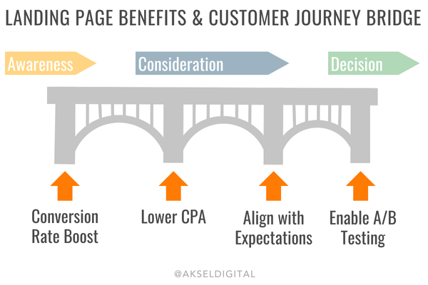
The Benefits of Using Landing Pages
- Boost Conversion Rates
By removing unnecessary navigation elements and presenting one clear call-to-action (CTA), landing pages significantly increase the likelihood that users will complete the desired action. Research shows that targeted landing pages can increase conversions by up to 10% compared to sending users to a homepage.
- Lower Cost-Per-Acquisition (CPA)
Because landing pages are so effective at converting traffic, they can dramatically reduce the cost per lead or customer in paid advertising campaigns. Every click counts, and a landing page ensures you’re making the most of every visitor.
- Align with Audience Expectations
A well-constructed landing page mirrors the messaging, tone, and offer of the ad or email that directed users there. This alignment, often called message match, builds trust and keeps visitors engaged.
- Enable A/B Testing and Data Collection
Landing pages provide an ideal environment for experimentation. By testing different headlines, CTAs, and layouts, you can optimise performance based on data rather than guesswork. They also allow you to track specific metrics like bounce rates, click-through rates, and conversions.
How Landing Pages Fit into the Customer Journey
Landing pages guide visitors along their buyer journey by offering tailored content at each stage:
- Awareness Stage: Capture attention with educational offers like free guides or webinars.
- Consideration Stage: Provide detailed information about products or services through case studies or product demos.
- Decision Stage: Use persuasive sales pages with testimonials, guarantees, and limited-time offers to close the deal.
Pro Tip
When designing landing pages, focus on one primary goal.
Whether it’s collecting emails or selling a product, a single, clear purpose ensures visitors are not overwhelmed with choices.
Real-Life Example
Consider a fitness brand running an ad for a free 7-day meal plan.
Sending users to a homepage filled with unrelated content could confuse or frustrate them.
However, a dedicated landing page offering the meal plan in exchange for an email address ensures the visitor gets exactly what they were promised—and the brand gains a valuable lead.
Planning Your Landing Page: The Essential First Steps
Creating an effective landing page starts with thorough planning. Before jumping into design or writing copy, it’s important to define your goals, understand your audience, and align your landing page with your broader marketing strategy. Skipping this step can lead to underperforming pages that fail to convert.
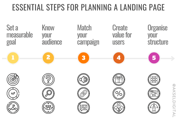
Define Your Goal
Every landing page should have a clear and measurable goal. Ask yourself: What action do I want visitors to take? This could be downloading a resource, signing up for a trial, registering for an event, or making a purchase. Avoid trying to achieve multiple objectives on a single landing page, as this can confuse visitors and dilute your message.
Pro Tip: Use SMART goals (Specific, Measurable, Achievable, Relevant, Time-bound) to ensure your objective is clear. For example, “Capture 500 email leads within 30 days through a landing page offering a free guide.”
Understand Your Target Audience
To create a landing page that resonates, you need to understand your audience’s needs, preferences, and pain points. Conduct research to determine:
- Who they are: Demographics, interests, and behaviours.
- What they want: The solutions or value they’re seeking.
- Where they are in the buyer’s journey: Awareness, consideration, or decision stage.
Tailor your page to speak directly to their concerns and desires, ensuring they feel understood and valued.
Example: A SaaS company targeting small business owners might use messaging like, “Save time and simplify your invoicing process.”
Align Your Message with Your Campaign
Your landing page should seamlessly reflect the ad, email, or link that brought visitors there. This is known as message match. Consistency in tone, visuals, and copy reassures users that they’re in the right place and makes them more likely to engage.
Pro Tip: Use Dynamic Text Replacement (DTR) to personalise landing pages based on the user’s search terms or ad copy. For example, if someone searches for “affordable CRM software,” your page could automatically adjust its headline to say, “Discover Affordable CRM Software Solutions.”
Choose the Right Offer
Your offer is the value you’re providing in exchange for the visitor’s action. It needs to be compelling enough for users to complete the CTA. Offers can include:
- Ebooks or guides
- Free trials or demos
- Discount codes or limited-time deals
- Webinar registrations
Ensure your offer is relevant to your audience’s needs and aligned with your business goals.
Example: An online retailer might create a landing page offering a 20% discount code for first-time shoppers.
Plan Your Content and Layout
Before you start designing, map out the structure of your landing page. Decide:
- What content elements you need (headline, subheadline, images, form).
- The flow of information (what appears first, what comes next).
- Where the CTA will be placed for maximum visibility.
Sketch a wireframe or outline to visualise the layout and ensure nothing essential is overlooked.
Pro Tip
Think mobile-first.
Ensure your content and layout are optimised for smaller screens, as a significant portion of your audience will likely access the page via mobile devices.
Structuring Your Landing Page for Success
A well-structured landing page is the backbone of high conversion rates. By organising elements in a way that captures attention and guides visitors naturally toward your call-to-action (CTA), you can significantly boost the effectiveness of your campaigns.

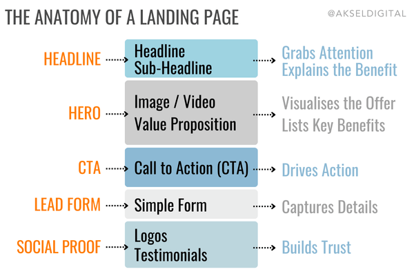
The Core Elements of a High-Converting Landing Page
- Headline and Subheadline
The headline is the first thing visitors see. It should immediately grab attention and communicate the value of your offer. A clear, benefit-driven headline answers the question: What’s in it for me?
- Example: “Increase Your Sales by 30% in 90 Days with Our Proven CRM Tool.”A subheadline can provide additional context or elaborate on the headline, helping to maintain interest.
- Example: “Streamline your customer management and close deals faster with tools designed for small businesses.”
- Hero Image or Video
A striking visual placed prominently on the page helps draw users in and reinforces your message. Use an image or video that:
- Shows the product or service in action.
- Illustrates the emotional or practical benefits for the user.
- Aligns with your brand identity.
Pro Tip: Video content can increase engagement and conversion rates, but ensure it loads quickly to avoid slowing down the page.
- Value Proposition
This section outlines the unique benefits of your offer. Use bullet points or short paragraphs to make it easy to digest.
- Example:
- Save hours with automated invoicing.
- Gain insights with real-time analytics.
- Securely store customer data in the cloud.
- Example:
- Call-to-Action (CTA)
The CTA is the focal point of your page. It should be action-oriented, visually distinct, and placed prominently above the fold.
- Example: “Get Started for Free” or “Download Your Guide.”
Pro Tip: Use a contrasting colour for the CTA button to ensure it stands out against the rest of the page.
- Example: “Get Started for Free” or “Download Your Guide.”
- Lead Form or CTA Button
If your goal is lead generation, include a simple, user-friendly form. Only ask for essential information—shorter forms typically lead to higher conversion rates.
- Example: Name and email fields for a free resource.For click-through pages, your button should take users to the next step, such as a checkout or signup page.
- Social Proof
Add credibility with testimonials, reviews, or logos of well-known clients. Real-life examples reassure visitors of the value and trustworthiness of your offer.
- Example: “This tool saved me hours every week!” – Jane Doe, Marketing Manager.
- Supporting Details Below the Fold
For users who scroll, include additional information such as FAQs, more benefits, or technical details. Keep it concise and visually appealing.
Optimising the Flow of Your Landing Page
The layout of your landing page should guide the visitor’s attention naturally from one element to the next. Consider the F-pattern, a common way people scan webpages:
- Start with a strong headline at the top.
- Use visuals and subheadings to break up text.
- Ensure the most important information appears above the fold.
Pro Tip: Test your layout by conducting a blink test. Show the page to someone for five seconds and ask them to describe what stands out. Your headline, value proposition, and CTA should be immediately clear.
Pro Tip
If your CTA involves a form, use a progress indicator for multi-step forms.
This reassures users by showing how close they are to completion, reducing drop-offs.
Real-Life Example
A SaaS company offering a free trial might structure their landing page like this:
- Headline:
“Simplify Project Management with [Tool Name].” - Subheadline:
“Save time, collaborate better, and deliver projects on time.” - Hero Image:
Screenshot of the tool’s interface with team members collaborating. - Value Proposition:
Key benefits in bullet points. - CTA:
“Start Your Free Trial Today.”
Designing a High-Converting Landing Page
The design of your landing page is crucial to its success. A visually appealing, user-friendly design builds trust, maintains attention, and ensures visitors can quickly grasp your message. Poor design, on the other hand, can confuse or frustrate users, driving them away before they convert.
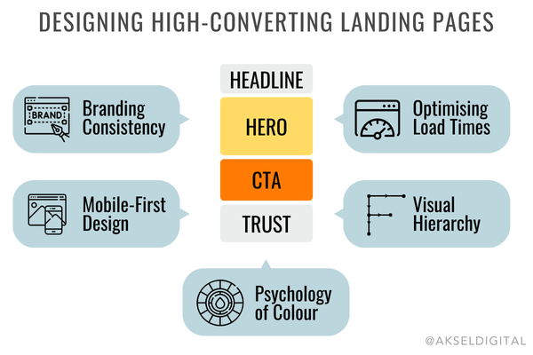
Branding Consistency
Your landing page should feel like an extension of your brand. Use consistent colours, fonts, and imagery that align with your website and marketing materials. This consistency fosters trust and reinforces brand recognition.
- Example: A fitness brand with a vibrant, energetic tone should use bold colours and dynamic images on their landing page.
Pro Tip: Always use your logo in a visible but non-intrusive location to remind visitors who you are.
Mobile-First Design
With a significant portion of users accessing pages on mobile devices, designing for smaller screens is non-negotiable. A mobile-first approach ensures that the most important elements—like your headline, visuals, and CTA—are clear and functional on any device.
- Simplify navigation and keep forms short for mobile users.
- Ensure CTA buttons are large enough to tap easily.
- Avoid heavy images or videos that may slow load times.
Pro Tip: Use responsive design tools to test your landing page on different screen sizes and devices.
The Psychology of Colour and Visuals
The colours you choose can have a significant impact on user behaviour.
- Use contrasting colours to make CTAs stand out. For instance, a red or orange button on a white background draws attention.
- Employ white space strategically to highlight key elements and prevent the page from feeling cluttered.
Visuals, including images and videos, play a key role in communicating your message.
- Choose high-quality visuals that reflect your offer.
- Use images of real people, preferably engaging with your product or service, to create relatability.
- Videos can demonstrate value quickly and persuasively—just keep them short and impactful.
Real-Life Example: A food delivery app landing page might feature an appetising image of meals alongside a “Get 20% Off Your First Order” CTA in a bold, contrasting colour.
Optimising Load Times
Fast-loading pages are critical to retaining visitors. Research shows that a one-second delay can reduce conversions by 7%. To ensure speed:
- Optimise images by compressing them without losing quality.
- Minimise the use of large video files.
- Use tools like Google PageSpeed Insights to measure and improve load times.
Pro Tip: Consider using Accelerated Mobile Pages (AMP) for lightning-fast load times on mobile devices.
Visual Hierarchy: Guiding User Focus
Design your page to guide the visitor’s eye naturally through the most important elements. Use the Z-pattern or F-pattern, which reflect how people typically scan webpages:
- Headline at the top.
- Hero image or video to the side.
- CTA in a central, eye-catching position.
Pro Tip: Use directional cues, such as arrows or images of people looking toward the CTA, to subtly guide user focus.
Real-Life Example
A SaaS company designed a landing page for their free trial, featuring:
- A clean, white background with a bright green “Sign Up Free” button.
- A video demo explaining the platform’s benefits.
- Social proof logos of well-known brands that use their software.
Result: By simplifying design and adding contrasting elements, they increased conversions by 25%.
Writing Copy That Converts
The words on your landing page are just as important as its design. Well-crafted copy can engage visitors, address their needs, and guide them toward taking action. The key is to keep your message clear, concise, and benefit-focused, ensuring that every sentence adds value.
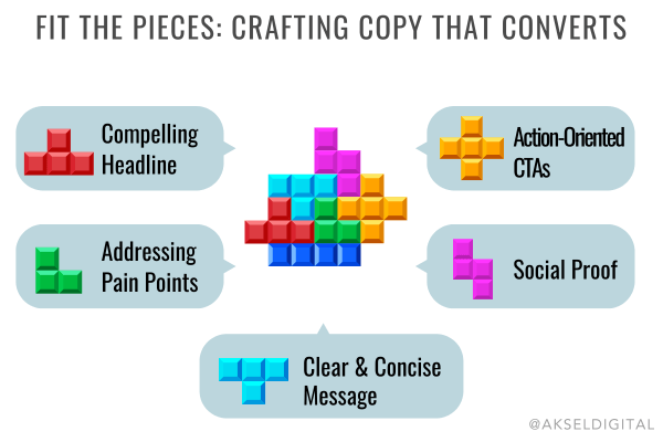
Crafting a Compelling Headline
Your headline is the first impression visitors will have of your landing page. It should immediately grab attention and communicate the primary benefit of your offer.
- Focus on Benefits: Highlight how the offer solves a problem or meets a need.
- Example: “Save 20 Hours a Week with Our Time-Tracking Tool.”
- Be Specific: Avoid vague statements and instead provide measurable outcomes.
- Example: “Boost Your Sales by 30% in Just 90 Days.”
Pro Tip: Test variations of your headline during A/B testing to find the one that resonates most with your audience.
Addressing Pain Points and Offering Solutions
Empathy is a powerful tool in copywriting. Show your audience that you understand their challenges, then present your solution as the answer.
- Example: “Struggling to keep track of expenses? Our automated invoicing tool eliminates the hassle and saves you time.”
Use this framework:
- Acknowledge the problem.
- Highlight the cost of inaction.
- Position your product or service as the ideal solution.
Keeping Your Message Clear and Concise
Visitors won’t read lengthy paragraphs. Keep your copy short and scannable:
- Use bullet points to summarise benefits.
- Break up text with headings and subheadings.
- Avoid jargon and write in simple, conversational language.
Example of Scannable Copy:
- Automate your workflow and save hours each week.
- Gain insights with easy-to-read analytics.
- Start with our free 14-day trial—no credit card required.
Pro Tip: Write for an eighth-grade reading level to ensure clarity and accessibility.
Using Personalised, Action-Oriented CTAs
Your Call-to-Action (CTA) copy should motivate users to take the next step.
- Action Verbs: Use clear, actionable language like “Download,” “Start,” or “Get.”
- Example: “Get Your Free eBook Now.”
- Personalised Messaging: Speak directly to the reader.
- Example: “Start Your Journey to Better Productivity.”
Pro Tip: Position CTAs as solutions to problems: “Fix My Schedule” is more engaging than “Sign Up.”
Incorporating Social Proof
Social proof builds trust and reassures users that your offer delivers on its promises. Include:
- Customer Testimonials: “This tool has revolutionised how we track projects!” – Jane, Project Manager.
- Statistics: “Over 10,000 satisfied users trust our platform.”
- Brand Logos: Showcase recognisable clients or partners.
Pro Tip: Make testimonials feel authentic by including names, job titles, and photos where possible.
Real-Life Example
A software company improved conversions by 20% after rewriting their headline to focus on benefits:
- Original:
“Powerful CRM Tools for Your Business.” - New:
“Organise Your Sales and Close Deals 30% Faster with [CRM Name].”
Adding a Persuasive Call-to-Action (CTA)
Your Call-to-Action (CTA) is the most important element of your landing page. It’s the driving force behind your conversion goals, prompting visitors to take the next step—whether that’s signing up, downloading, or making a purchase.
A well-crafted CTA is action-oriented, visually distinct, and strategically positioned to maximise engagement.
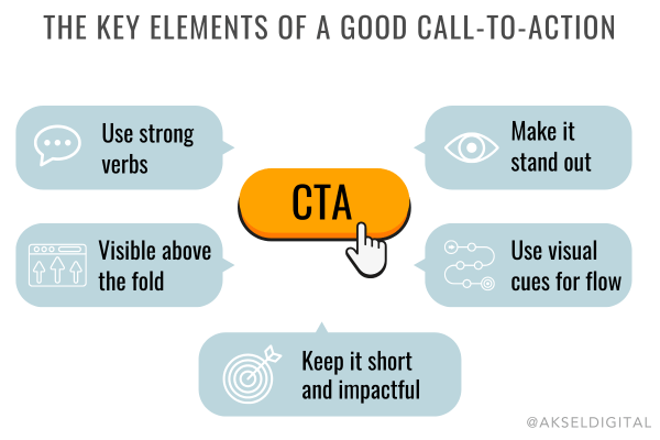
What Makes a Great CTA?
- Actionable Language
A CTA should tell the visitor exactly what to do using clear, direct language. Start with strong action verbs like “Get,” “Download,” “Start,” or “Claim.”
- Example: “Download Your Free Guide” or “Start Your Free Trial Today.”
- Highlight the Benefit
Emphasise what the visitor will gain by clicking the CTA. Rather than generic prompts, focus on outcomes.
- Example: “Boost Your Leads Now” is more compelling than “Click Here.”
- Keep It Concise
The most effective CTAs are short and impactful—ideally no more than five words. Avoid overloading with unnecessary details.
- Example: “Claim Your Discount Now.”
- Create a Sense of Urgency
Encourage immediate action by incorporating urgency into your CTA.
- Example: “Sign Up Before the Offer Ends” or “Get 50% Off—Today Only.”
Placement: Where Should Your CTA Go?
- Above the Fold
Your primary CTA should be visible as soon as visitors land on your page. This ensures they don’t have to scroll to see it.
- Pro Tip: Test sticky CTAs that remain visible as users scroll.
- At Logical Points
For longer landing pages, include secondary CTAs at key moments, such as after explaining benefits or social proof. Ensure all CTAs lead to the same action.
- In the Path of User Flow
Position CTAs where they naturally catch the visitor’s eye, such as the centre of the page or just below compelling copy.
CTA Design Best Practices
- Make It Stand Out
Use a contrasting colour for your CTA button to ensure it grabs attention.
- Example: A red or orange button on a predominantly white page creates high visibility.
- Use a Button, Not a Link
CTAs work best as buttons that visually signal they are clickable. Avoid plain text links that may go unnoticed.
- Provide White Space
Surround your CTA with sufficient white space to make it stand out and avoid clutter.
- Add Directional Cues
Subtle visual elements, like arrows or images of people looking toward the CTA, can draw attention to the button.
Pro Tip
Personalise CTAs based on user behaviour.
For example, a returning visitor might see a tailored prompt like, “Resume Your Journey to Better Productivity,” while a first-time visitor sees, “Get Started for Free.”
Real-Life Example
A travel company optimised their CTA from “Submit” to “Plan Your Dream Holiday Now,” combined with a bright green button.
This small change increased conversions by 22% because it conveyed action and benefit.
Optimising Landing Page Performance
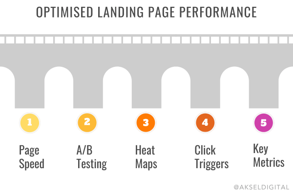
Even the best-designed landing pages can be improved with ongoing optimisation. Regularly testing and refining your page ensures that it continues to convert effectively and remains aligned with user expectations. From analysing performance metrics to implementing A/B tests, optimisation is a critical part of maximising ROI.
The Importance of Page Speed
A fast-loading landing page is essential for retaining visitors. Studies show that a delay of just one second can reduce conversions by 7%. Slow-loading pages frustrate users and increase bounce rates, particularly on mobile devices.
How to Improve Page Speed:
- Compress images to reduce file size without sacrificing quality.
- Minimise the use of large video files or complex animations.
- Use tools like Google PageSpeed Insights to identify performance bottlenecks.
- Enable browser caching and utilise a Content Delivery Network (CDN) to deliver assets more quickly.
Pro Tip: Test your page speed on both desktop and mobile devices to ensure consistency.
A/B Testing for Continuous Improvement
A/B testing, also known as split testing, involves creating two variations of your landing page and comparing their performance. This data-driven approach allows you to make informed decisions about design and content changes.
What to Test:
- Headlines: Test variations with different messaging or tones.
- Example: Compare “Boost Your Productivity” vs “Save Hours Every Day.”
- CTAs: Experiment with button colour, placement, or copy.
- Images and Videos: Evaluate the impact of different visuals or the presence of video content.
- Form Fields: Test shorter forms (e.g., name and email only) against longer forms.
Pro Tip: Test one element at a time to isolate the impact of each change.
Analysing User Behaviour with Heatmaps
Heatmaps are visual tools that show where users click, scroll, and spend the most time on your landing page. By identifying areas of high and low engagement, you can refine your page layout to better guide visitors toward your CTA.
Example of Insights from Heatmaps:
- If users are ignoring your CTA, reposition it or make it more visually distinct.
- If users stop scrolling halfway through the page, move key information higher.
Pro Tip: Tools like Hotjar or Crazy Egg provide easy-to-read heatmaps and valuable analytics.
Click Triggers: Enhancing Engagement
Click triggers are small, persuasive elements placed near your CTA to reduce hesitation and encourage action. These can include:
- Money-back Guarantees: “Risk-Free for 30 Days.”
- Scarcity Tactics: “Only 3 Seats Left—Book Now!”
- Social Proof: “Join 20,000+ Happy Customers.”
Real-Life Example: An online course provider increased signups by 15% after adding a “Seats Filling Fast” message next to their registration CTA.
Monitoring Key Performance Metrics
Tracking the right metrics helps you understand how your landing page is performing and where improvements are needed. Key metrics to monitor include:
- Conversion Rate: Percentage of visitors who complete your desired action.
- Bounce Rate: Percentage of visitors who leave without engaging.
- Traffic Sources: Identify which channels are driving the most conversions.
- Form Abandonment Rate: Percentage of users who start but don’t complete a form.
Pro Tip: Use analytics tools like Google Analytics or Mixpanel to track these metrics and set up custom dashboards.
Real-Life Example
A B2B software company conducted A/B testing on their landing page headline:
- Variation 1: “Simplify Your Workflow with [Tool Name].”
- Variation 2: “Save Time and Focus on What Matters with [Tool Name].”
The second variation saw a 20% increase in conversions, as it resonated better with the audience’s pain points.
Tools and Platforms for Building Landing Pages
Creating a landing page doesn’t require extensive technical expertise. With the right tools and platforms, you can quickly design professional, high-converting pages tailored to your audience’s needs. These tools often include drag-and-drop editors, templates, and integrations to streamline the process.
Popular Landing Page Builders
- Unbounce
- Features: Advanced A/B testing, drag-and-drop editor, and dynamic text replacement for personalisation.
- Best For: Marketers who want flexibility and optimisation tools.
- Example Use Case: Creating a landing page for a Google Ads campaign that dynamically matches the search term.
- Leadpages
- Features: Pre-designed templates, mobile responsiveness, and lead capture forms.
- Best For: Small businesses looking for simple, conversion-focused pages.
- Example Use Case: A local service provider offering a free consultation via an easy-to-build page.
- Instapage
- Features: Collaboration tools, heatmaps, and integration with CRM platforms.
- Best For: Teams that require detailed analytics and testing.
- Example Use Case: A SaaS company launching a landing page for a webinar registration.
- HubSpot Free Landing Page Builder
- Features: Built-in CRM integration, AI copywriting tools, and analytics.
- Best For: Businesses already using HubSpot for marketing automation.
- Example Use Case: A startup collecting leads for a free product trial.
- WordPress
- Features: Customisable themes and plugins like Elementor for drag-and-drop editing.
- Best For: Businesses with existing WordPress sites looking to add landing pages.
- Example Use Case: A blog offering a free eBook download via a dedicated page.
Benefits of Using Landing Page Tools
- Ease of Use: Drag-and-drop editors make it easy for non-designers to create visually appealing pages.
- Pre-Designed Templates: Ready-to-use layouts save time and ensure best practices.
- Analytics Integration: Track performance metrics directly within the platform.
- A/B Testing: Many platforms include built-in testing capabilities to optimise pages.
- CRM and Email Integration: Automatically sync leads with your email marketing or CRM tools.
Choosing the Right Tool for Your Needs
When selecting a landing page builder, consider:
- Budget: Some platforms, like WordPress, are more cost-effective but require additional plugins. Others, like Unbounce, may have higher upfront costs but offer advanced features.
- Skill Level: If you’re a beginner, opt for platforms with intuitive interfaces and templates.
- Integration Requirements: Ensure the tool integrates with your existing CRM, email marketing software, or analytics tools.
- Scalability: If you plan to run multiple campaigns, choose a tool that can handle high volumes of traffic and data.
Pro Tip: Many tools offer free trials—use them to test functionality and find the platform that best suits your workflow.
Real-Life Example
A small eCommerce business used Leadpages to create a landing page offering a 20% discount for new customers.
By integrating the page with their email marketing platform, they collected over 1,000 email addresses in the first week, which they later nurtured into loyal customers.
Post-Conversion: What Comes Next?
Converting a visitor on your landing page is just the beginning. The post-conversion phase is critical for nurturing leads, driving further engagement, and ultimately turning those leads into loyal customers. By implementing strategic follow-ups and providing a seamless user experience, you can maximise the value of every conversion.
The Role of the Thank-You Page
A thank-you page is where visitors are directed after completing your landing page’s form or action. It serves several purposes:
- Deliver the Offer: Provide immediate access to the promised resource, such as a download link or confirmation of a free trial.
- Express Gratitude: A simple “Thank you” builds goodwill and leaves a positive impression.
- Encourage Further Engagement: Use the thank-you page to suggest related actions, such as:
- Following your social media accounts.
- Subscribing to your blog.
- Exploring other valuable content on your website.
Example: “Thank you for signing up! Download your eBook below and follow us on Instagram for more marketing tips.”
Pro Tip: Add a secondary CTA on your thank-you page to keep the user engaged, such as “Book Your Free Consultation” or “Watch Our Webinar.”
Nurturing Leads Through Email Follow-Ups
Email marketing is a powerful way to keep the conversation going after a user converts. A well-crafted follow-up sequence can build trust, educate the lead, and guide them further down the sales funnel.
Key Elements of an Effective Follow-Up Email:
- Timeliness: Send the first email immediately after the conversion to confirm their action and deliver the promised resource.
- Personalisation: Use the lead’s name and tailor content to their interests or the offer they engaged with.
- Example: “Hi [Name], thanks for downloading our eBook! Here’s how to get started.”
- Provide Value: Share additional resources, tips, or case studies related to the user’s needs.
- Example: “Top 5 Ways to Improve Your Marketing ROI Today.”
- Include a CTA: Encourage the lead to take the next step, such as signing up for a webinar, booking a demo, or exploring your product.
Pro Tip: Use marketing automation tools to schedule follow-ups and segment leads based on their behaviours or preferences.
Retargeting for Re-Engagement
Not all visitors who interact with your landing page will convert immediately. Retargeting campaigns can bring back those who abandoned the process or didn’t engage fully.
How Retargeting Works:
- Use tools like Google Ads or Facebook Pixel to track visitors to your landing page.
- Serve targeted ads reminding them of your offer or showcasing additional benefits.
- Example: “Still thinking about our free trial? Sign up today and get a bonus guide!”
Pro Tip: Retargeting ads should create urgency or offer an incentive to re-engage, such as limited-time discounts or exclusive content.
Building Long-Term Relationships
Once a lead converts, focus on fostering a lasting relationship that turns them into a customer—and eventually, a loyal advocate for your brand.
- Use Personalised Content: Send tailored emails, offers, or updates based on their behaviour.
- Collect Feedback: Ask leads about their experience to improve your process and build trust.
- Introduce Loyalty Programmes: Reward repeat customers with discounts, exclusive deals, or early access to new products.
Pro Tip
Don’t let post-conversion efforts feel transactional.
Build genuine connections by providing ongoing value, and always follow through on your promises.
Real-Life Example
A B2B consultancy used a thank-you page to upsell webinar attendees into a one-on-one strategy session. By adding a secondary CTA (“Book Your Free Strategy Call”), they increased consultation bookings by 35% after the webinar.
Common Mistakes to Avoid
Even a well-designed landing page can fail to convert if common pitfalls are not addressed. By identifying and avoiding these mistakes, you can ensure your landing pages perform at their best and achieve their goals effectively.
Overcomplicating Your Design
A cluttered landing page with too many elements can overwhelm visitors and dilute your message. Avoid:
- Too Many CTAs: Stick to one primary call-to-action to avoid confusing your audience.
- Excessive Visuals: While visuals can enhance your page, too many images or animations can slow down load times and distract visitors.
Pro Tip: Use white space strategically to draw attention to key elements like your headline and CTA.
Asking for Too Much Information
Long forms can scare away potential leads. Every additional field you include increases friction, which may lead to higher abandonment rates.
- Example: A form asking for name, email, phone number, and job title may perform worse than one asking for just a name and email.
Pro Tip: Start with essential fields and ask for additional details later in the nurturing process.
Ignoring Mobile Responsiveness
With mobile devices accounting for a significant portion of web traffic, a non-responsive landing page can alienate a large part of your audience. Common issues include:
- Text or buttons that are too small to read or click.
- Images that don’t scale properly, disrupting the layout.
Pro Tip: Test your landing page on multiple devices and screen sizes to ensure a seamless experience.
Failing to Align Your Message with Your Ad
If the headline or offer on your landing page doesn’t match the promise made in your ad, visitors may bounce. This disconnect can lead to a loss of trust and reduced conversions.
- Example: An ad offering “20% Off for First-Time Customers” should lead to a page prominently displaying this discount.
Pro Tip: Use consistent language and visuals across your ads and landing pages to create a cohesive experience.
Neglecting Page Speed
Slow-loading pages drive visitors away, particularly on mobile devices. As attention spans shrink, even a delay of a few seconds can significantly impact conversions.
- Example: A landing page with uncompressed images and unnecessary scripts may load too slowly, causing users to abandon it.
Pro Tip: Use tools like Google PageSpeed Insights to identify performance bottlenecks and make improvements.
Forgetting to Test and Optimise
Assuming your landing page is “perfect” after launch is a critical mistake. Without A/B testing and optimisation, you miss opportunities to improve performance.
- Example: A headline that resonates with one audience may fall flat with another.
Pro Tip: Regularly test different variations of headlines, CTAs, and layouts to determine what works best.
Skipping Social Proof
A lack of testimonials, reviews, or case studies can make your landing page feel untrustworthy. Visitors want reassurance that others have benefited from your product or service.
- Example: A landing page without customer testimonials might convert poorly compared to one featuring quotes from satisfied users.
Pro Tip: Include real names, photos, and job titles in testimonials to boost authenticity.
Real-Life Example
A fitness app discovered that reducing the number of fields in their lead capture form from five to two (name and email) increased signups by 40%.
This small change eliminated friction and made the signup process feel faster and easier.
Create Landing Pages That Drive Results
Landing pages are more than just another web page—they are the foundation of a high-performing digital marketing strategy.
When done right, they serve as conversion machines, turning clicks into leads, sales, and loyal customers.
By understanding the principles of effective landing pages and applying the best practices outlined in this guide, you can maximise your return on investment and elevate your marketing efforts.
Key Takeaways
- Focus on One Goal: Every landing page should be designed with a single, clear objective to guide visitors toward action.
- Plan Strategically: Start with a well-defined goal, a deep understanding of your audience, and a compelling offer.
- Design for Impact: Keep your layout clean, mobile-friendly, and visually appealing, with a strong emphasis on your CTA.
- Optimise Continuously: Use A/B testing, heatmaps, and analytics to refine your pages and achieve the best possible conversion rates.
- Follow Through: Nurture leads after conversion with thank-you pages, email follow-ups, and retargeting campaigns.
By combining these strategies, you’ll create landing pages that not only attract visitors but also convert them into valuable leads and customers.
Your Next Step: Let Us Help You Build High-Converting Landing Pages
Creating effective landing pages requires skill, creativity, and experience. At Aksel Digital Marketing Agency, we specialise in designing landing pages that drive real results.
From expert UI/UX design to advanced analytics and optimisation, our team can help you create pages that align with your business goals and deliver measurable success.
Ready to take your landing pages to the next level?
Explore our web design services or contact us today to get started!
Final Pro Tip
Don’t be afraid to experiment.
The most successful landing pages are built on insights gained through testing and iteration.
Start small, refine your approach, and watch your conversions soar.
Author Spotlight
Ayca Wilson
Creative Director
Ayca is the Creative Director at Aksel Digital, combining creativity and strategic thinking to craft impactful campaigns. With her eye for design and talent for storytelling, she shapes visually compelling brand identities for clients.
Ayca lives in leafy Fleet with her husband and their three dogs. A bookworm and keen baker, she enjoys dog walks, cooking, and travelling.

